When working with matrix grids, you can select a design preset from the Grid Design drop down in the Component ribbon. Each design preset alters the way the matrix grid is presented, helping you find a format that best displays the data in your grid. The colors are dependent on the selected design theme.
Set the Grid Design
Set the grid design from the Component ribbon. Toggle the arrows to expand the menu (red highlight below).

When expanded, you'll see several grid design options:
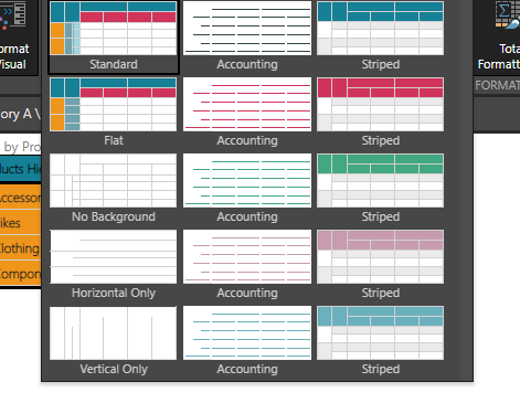
Standard
Standard mode displays headers for both rows and columns:

If the grid contains a regular hierarchy on rows, the member captions for the expanded levels of the hierarchy are indented:

Striped
Striped mode displays each grid row in alternating colors, and displays only column headers with a highlight (the row headers are not highlighted):

If a regular hierarchy is added to rows, the member captions of the expanded levels will be indented:

Flat
The flat mode indents all member captions of the hierarchy on rows:

This is useful if a regular hierarchy is placed on the rows and you want all levels of the hierarchy to be aligned:

Accounting
The accounting mode removes the grid, column, and row borders. The column headers are displayed in bold underlined font. The row headers are not emphasized if an attribute hierarchy was added to rows:

If a regular hierarchy is added to rows, the member captions for the top levels will be bolded and underlined, while the bottom level is not. Each expanded level is indented.

No Background
Shows the matrix grid with no background colors:

Horizontal Only
Shows the matrix grid without background colors and with horizontal lines only:

Vertical Only
Shows the matrix grid without background colors and with vertical lines only:
